Background
W.S. Del Fin Inc. operates at the intersection of food and merchandise, offering discerning customers a curated selection of gourmet products and luxurious merchandise. Despite its reputation for excellence, the company recognized the need to refresh its visual identity to resonate more deeply with its target audience and communicate its values effectively.
Objective
The primary objective of the logo redesign was to convey W.S. Del Fin Inc.'s dedication to luxury, refinement, and quality while maintaining a timeless elegance that would endure for years to come. The logo needed to encapsulate the brand's heritage, sophistication, and commitment to excellence while also reflecting its forward-thinking approach.
Process

Discovery Phase
Conceptualization


Iterative Design
Through a series of iterative design iterations, I refined and honed the initial concepts, incorporating feedback from key stakeholders and conducting thorough evaluations of each design element.
I experimented with different font weights, spacing, and color combinations to achieve optimal visual impact and cohesiveness.
Typography Selection
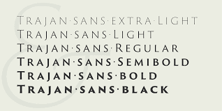
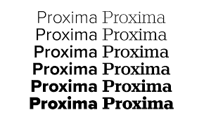
After careful consideration, I selected Trajan Pro 3 as the primary typeface for the company name, "W.S. Del Fin," to evoke a sense of tradition, sophistication, and refinement and Proxima Nova for the name "Inc.".
I use of Trajan Pro 3 Semibold for "W.S." added emphasis to the initials, while Trajan Pro 3 Regular for "Del Fin" maintained consistency and "Inc." for its modern aesthetic, readability, versatility, alignment with the brand image, and ability to maintain distinctiveness within the overall design.
Color Palette


Iconography
To complement the typography, I've explored the incorporation of subtle visual elements that symbolized the company's core values and offerings. Ultimately, I have decided to forgo the use of icons or symbols, opting instead to let the typography speak for itself and serve as the focal point of the logo.
Outcome
The final logo design for W.S. Del Fin Inc. successfully captured the essence of the brand, embodying luxury, refinement, and quality. The elegant typography, sophisticated color palette, and meticulous attention to detail coalesced to create a visually striking and timeless logo that resonated with both existing and prospective customers.

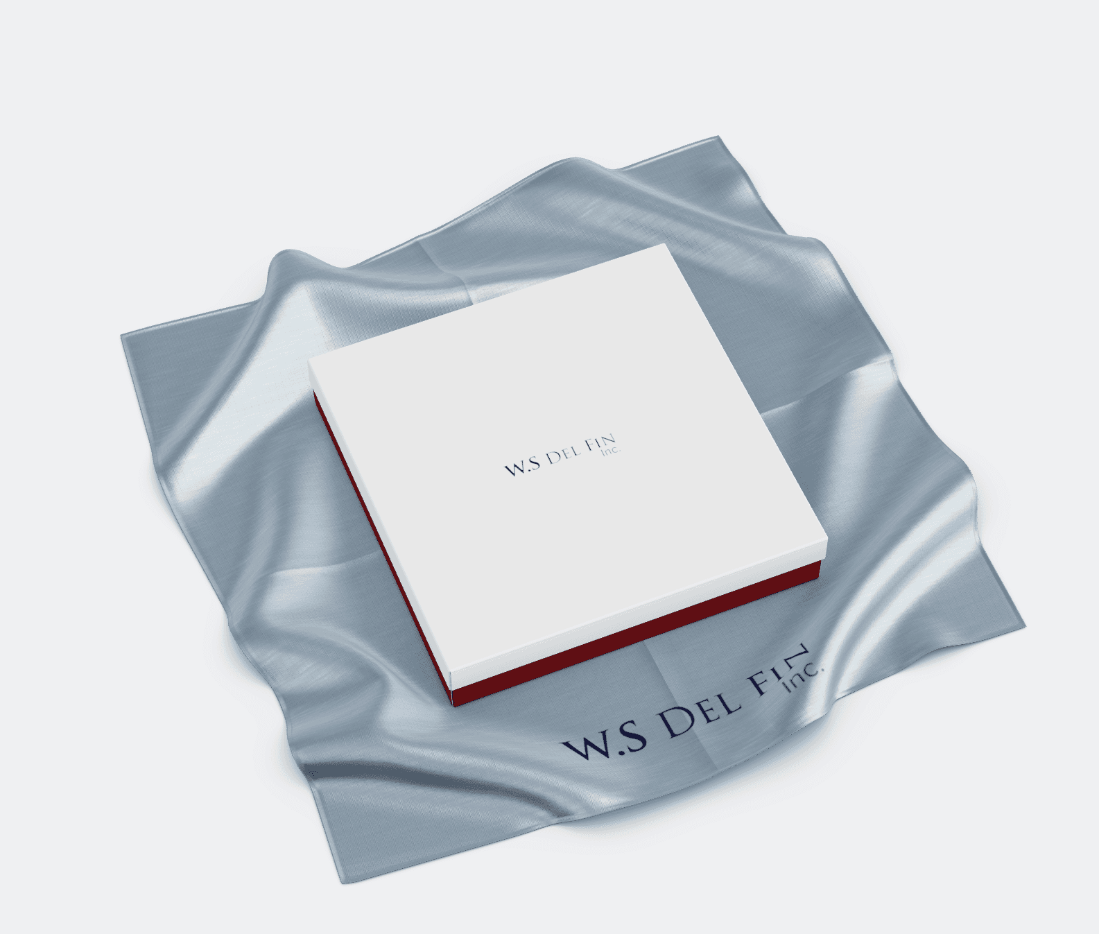
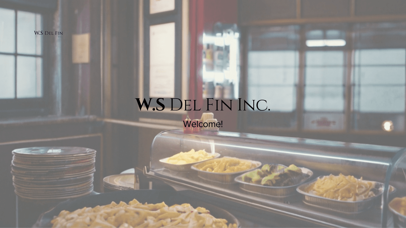
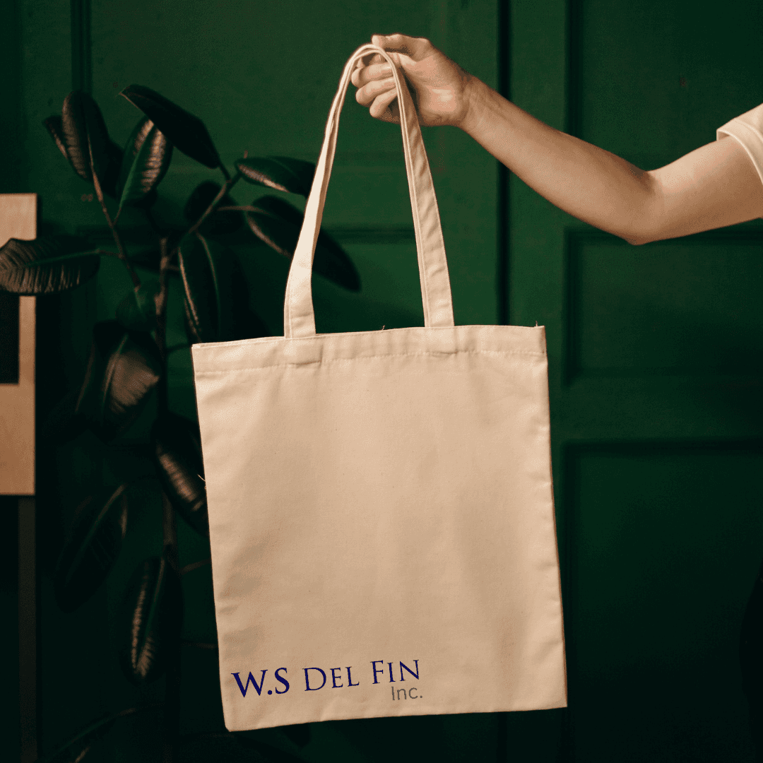
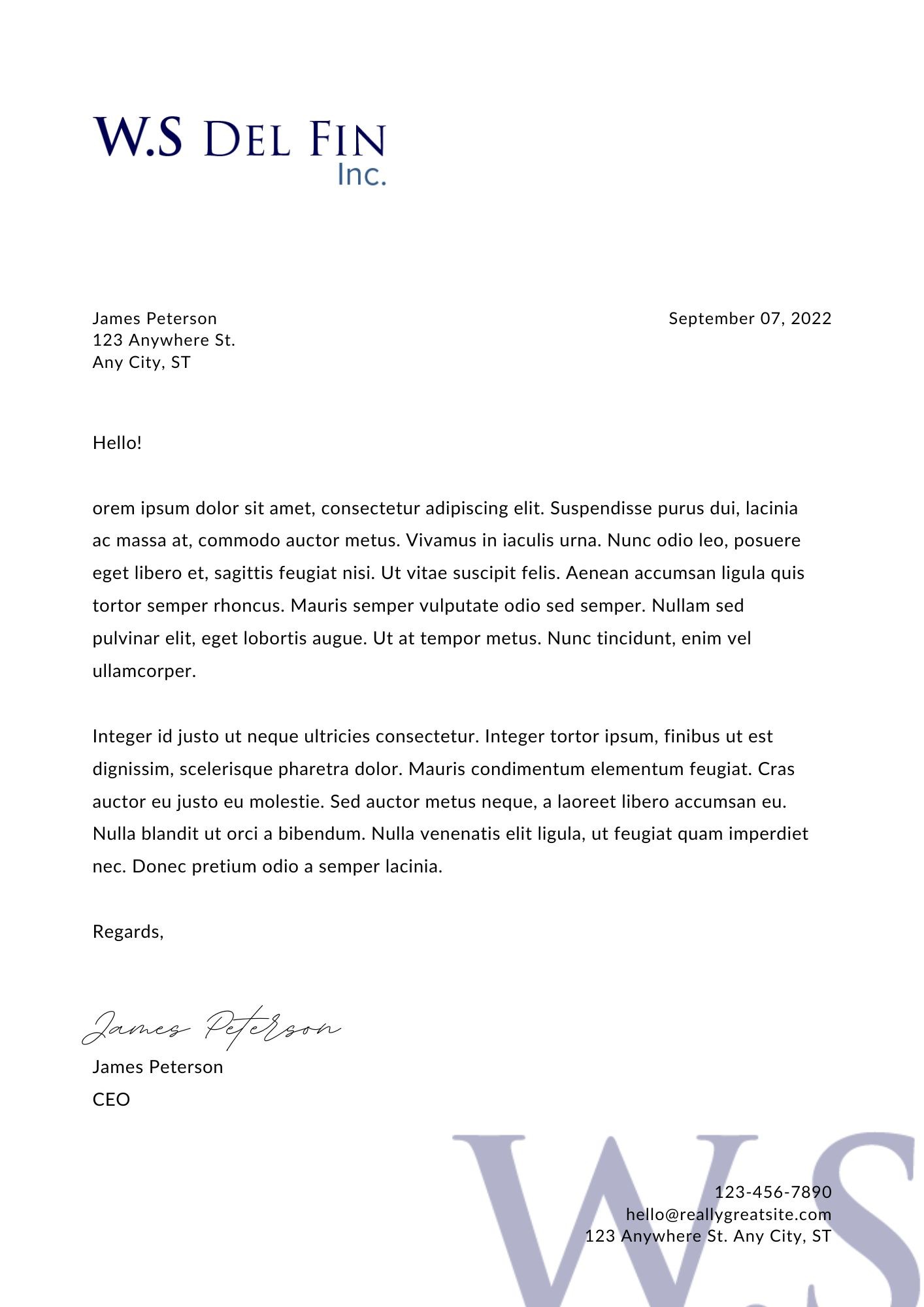
Mockups
Mockups showcase the logo applied to various branding materials, including boxes, letterheads, and digital platforms such as a website header and social media profile. The logo's versatility and scalability are demonstrated across different contexts, reinforcing its effectiveness as a visual representation of Mesa Verde Community Inc.
Conclusion
The redesign of W.S. Del Fin Inc.'s logo was a collaborative and iterative process guided by a deep understanding of the brand's identity and aspirations. Through strategic design decisions and meticulous craftsmanship, the new logo effectively communicated the company's commitment to luxury, refinement, and excellence, reinforcing its position as a leader in the food and merchandise industry.